
Upside-Down Painting Reveals Inverted Worldview of Modern Art.
Deciphering Hidden Codes.
by Edwin Benson https://www.tfp.org/upside-down-painting-reveals-inverted-worldview-of-modern-art/
Over coffee in the office, a young acquaintance recently related an experience that exposed the false values of the modern art world. He had gone to an art museum with an older sister. He stood looking at one piece of so-called abstract art. He told his sister, “That doesn’t make sense to me.” An older woman looking at the next painting loudly whispered to him, “Art doesn’t need to make sense.”
The Topsy-Turvy World of Modern Art
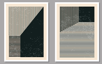
That anecdote came back to me when I saw an article in ADN-America about a German art gallery, the Kunstsammulung Nordrhein-Westfalen. Sometime during the eighties, the museum purchased a painting by Piet Mondrian (1872-1944). When the museum hung the painting—which consists of twenty-three straight lines in yellow, orange, blue and black —the workers inadvertently displayed it upside down. No one noticed the mistake until a photograph of the artist’s studio recently surfaced with the painting hanging correctly.
The painting is titled “New York City 1.” It is one of several New York-inspired paintings of similar straight lines done in 1941 and 1942. It bears no resemblance to the city at all. It does not make sense.
The embarrassed museum administration tried to deflect criticism by indulging in pseudo-intellectual art talk. The error was really “an experiment.”
“If we go along with the experiment and rotate New York City 1 by 180 degrees, we find that the picture still works. In fact, it functions extremely well: the composition gains in intensity and plasticity.”
Silliness Wrapped Up as Wisdom
“The density of the strips along the top edge lends the work a resemblance to its close relative ‘New York City,’ in which the zone of greatest density is also located at the top edge. The blue strips along the left, top, and lower edges are now positioned in exactly the same places.”
The description by the Encyclopedia Britannica expounds on Mr. Mondrian’s artistic sensibilities.
“In his mature paintings, Mondrian used the simplest combinations of straight lines, right angles, primary colors, and black, white, and gray. The resulting works possess an extreme formal purity that embodies the artist’s spiritual belief in a harmonious cosmos.”
Such sophisticated twaddle is not convincing. It only tries to endow the banal with beauty and inevitably fails.
Most of those who do not admire so-called modern art ignore it. It is easy to chortle at the “artist” and those who pride themselves on their ability to read deep meaning into it. That is a mistake. Modern art has a serious purpose aimed at destroying beauty.
Deciphering Hidden Codes
Art critic Father Anthony Brankin claims that modern art sends a subliminal message to viewers that ends up destroying art and glorifying ugliness.
“The subliminal message in every confused and misshapen piece of modern architecture, art, music, or drama is that there is no God. The subliminal message in every deliberate mutilation of natural forms, in every tribute to physical and personal perversion, is that there is no God. The subliminal message in every celebration of the weird and deathly is that there is no God. This subliminal message is as surely the ‘Illuminated Gospel of Death’ as any culture could have ever proclaimed, and by virtue of its omnipresence in every aspect of modern life, we are constantly encouraged to accept this gospel.”
TFP writer and scholar Michael Whitcraft expands upon Father Brankin’s conclusions by tying them to a common aspect of modern life.
“This attitude is prevalent throughout our society…. Ripped jeans are a good example of this. When someone wears ripped jeans, they take one of the least sublime fabrics in existence, denim, and then do the only thing that can be done to make it more vulgar: tear holes in it.”
The Absence of Beauty
For the contemporary practitioner of any creative process—be it painting, sculpture, architecture, writing and so on—the worst criticism is that the work is “derivative” or lacking originality. The goal is to “push the envelope” by creating something new and unique. According to this philosophy, one becomes an artist only after doing “groundbreaking” work, like pawning off paintings of straight lines.
This attitude is most unfortunate because it denies the sense of beauty. Consider the style of modern architecture known as “brutalism.” These structures, most often constructed of reinforced concrete, are typified by mass and structural angles. The mechanics of the building—beams, trusses, ducts and similar features—are on full display. Often the concrete wall surfaces are unpainted.
An excellent example is the Metropolitan Cathedral of Saint Sebastian in Rio de Janeiro, Brazil. It looks like a giant concrete cone. Mayan temples supposedly inspired its architect. It is a truly ugly confection whose interior appears dark and forbidding, despite an abundance of colored glass. It has all the charms of an elevator shaft with a skylight at the top.
What is the purpose of such a building? It does not elevate God. It reminds no one of mankind’s common goal—Heaven. If it inspires awe, that sensation is one of overwhelming oppression. It is, however, unique. No doubt, the architect won the admiration of his peers. He created a monument to modernism.
My heart fills with regret when I reflect on the magnificent structure they could have constructed by emulating the magnificent cathedral architecture of Europe. Who knows how many would have been inspired in much the same way Sainte-Chapelle does so well?
But that would be derivative.